Nobody Could Read Our Labels
We spent months getting Celeste Naturals’ products right. Ingredient research, formulation testing, brainstorming how different ingredients lined up with both performance and our actual brand values. Sizes, shapes, colors, scents, skin benefits. We treated the soap like it mattered, because it did.
Then we got to the box, and decided that could just be our best guess. What followed was a string of packaging mistakes that took months and real money to unwind.
What we were going for
We’re not the most artistic people alive, so we picked a lane early: minimal, luxurious, calm. Whatever that meant in practice, we’d figure out as we went.
What we landed on, at least on the design template, looked genuinely great. A soft purple gradient background, white lettering for the brand name, “handcrafted soap,” net weight, where it was made, instructions for use, all the stuff that stays consistent across every product. Our logo sat bisected in the upper right corner, wrapping elegantly around the edge. We’ve mentioned before that our packaging wasn’t ready. This is the part where I show my work.
The math nobody warns you about
Before we ever got to legibility, we ran into a problem that had nothing to do with design: boxes cost real money, and “real money” scales in the worst possible direction when you’re small.
Custom boxes, produced domestically, quoted out at $2.50 a piece and up. Go through a supplier in China instead and the per-unit price dropped to something like $0.20, except now you needed to order 1,000+ units, per scent. We brought eight scents of soap to our first market. Do that math and you land on 8,000 boxes for a table that was, at the time, two folding tables and a prayer.
So we split the difference. One box design, used across everything, with custom stickers layered on top to carry the scent-specific information: name, ingredients, whatever else needed to change per product. Cheaper, flexible, smart on paper.
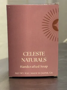
Where the packaging mistakes actually started
The sticker plan hit three separate walls, and each one made the next one worse.
First: we didn’t want the sticker to stand out. The goal was for it to melt into the box, not sit on top of it like a patch. Fine, easy fix, we used a clear sticker.
Second: clear sticker, dark purple background. To be legible, the printed text needed serious contrast, which meant it needed to be light, ideally the same bright white already printed on the box itself. Here’s the fact nobody tells you until you’re mid-order: most home and small-batch printers don’t print white. They treat white as “no ink here” and let the paper (or in our case, nothing) show through. Our sticker’s brightest realistic option was yellow. Yellow was visible, technically. It also looked nothing like the white text right below it, which meant every label was quietly arguing with the box it was stuck to.
Third: with white off the table, we matched the sticker text to the brown from our logo instead. It blended better, it didn’t clash, and it was the best option that didn’t involve leaving off required information or throwing out boxes we’d already paid for. “Best option” is doing a lot of work in that sentence. It was still brown text on a clear sticker on a dark purple box, which is not a sentence that ends in “easy to read.”
The last piece was almost a relief by comparison: consistency across the rest of the line. Candles, lotion sticks, sugar scrubs, all came in unlabeled vessels, so we worked with Online Labels to color-match stickers to the box and at least keep the whole table looking like one brand instead of four.
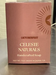
How people actually responded
Here’s the part that made this hard to act on quickly: most people were nice about it. Genuinely nice, not polite-nice. They said it looked like a quality box, that it didn’t “look like a small maker.” Those boxes were on the table when we got invited to join our town’s small business incubator. Turns out people in small towns are generally pretty decent to new vendors.
But underneath the compliments, we started noticing the smaller stuff, some of which nobody said to our faces directly. People asking which scent was which. People squinting at the box, tilting it toward the light, visibly working harder than they should have to just to figure out what was in front of them. Once we were inside the incubator, other makers started passing along customer feedback more bluntly than customers themselves had: nice boxes, hard to read.
That’s useful feedback and a lousy thing to hear in the same breath. Packaging is the first impression a potential customer gets. If it’s confusing, if it takes more effort than it’s worth to decode, people don’t push through it, they just walk away and buy the soap next to yours instead. We knew that. We also couldn’t afford, at that specific point, to blow up the design and start over, or even patch it with something meaningfully better. So we sat with it longer than we wanted to.
What we actually changed
Once we’d set aside the budget for it, we treated the redesign like the first design should have been: real research into how to hit “minimal, luxurious, calm” without sacrificing legibility, instead of guessing and hoping.
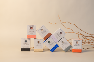
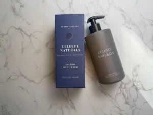
The stickers were the first thing to go entirely. The purple was elegant, but it had created a contrast problem we were re-solving on every single product, forever, and it wasn’t worth the fight. We now use color itself to signal scent across the line, paired with better contrast and bolder fonts, so reading the label isn’t a task anymore. Every choice on the current packaging is deliberate, aimed at one goal: make it as easy as possible for someone to look at the product and understand what it is.
Would we do it differently
Without hindsight, no. We wouldn’t have iterated as fast or ended up with as clear a list of what to fix if we hadn’t made those first mistakes and had customers, and fellow makers, tell us about them. It cost us time, money, some frustration, and a fair amount of ego. All of that turned into a blueprint we still use now, every time we think about how a new product is actually going to land with someone standing at our table, deciding in about four seconds whether to pick it up.
With hindsight, though, a couple of things change. We’d have started with a white box instead of purple, if only because it removes the entire contrast problem before it exists, no clear stickers, no chasing white ink that doesn’t print, no compromise landing on brown. And knowing what we know now about how fast a product line actually shifts in year one, we’d probably have taken the higher per-unit cost and ordered a smaller volume instead of chasing the economies of scale at 1,000+ units. We ended up tossing a meaningful number of empty boxes when we pivoted the design, which quietly erased a good chunk of the savings we thought we’d locked in by buying in bulk. We didn’t use up the run before we could afford to move on, so the “cheaper per unit” math never really paid off the way it looked like it would on paper.